Designing a scalable, white-label logistics platform built for daily, high-intensity use
Project challengeCargoflux is a logistics platform used by freight forwarders and shipping operators to manage complex workflows across booking, documentation, and shipment tracking.
I redesigned the desktop platform and build a scalable white-label design system for professional users working daily in dense, data-heavy interfaces.
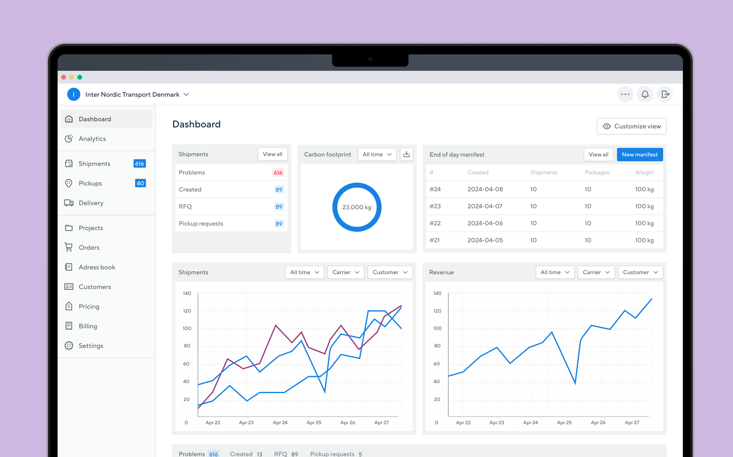
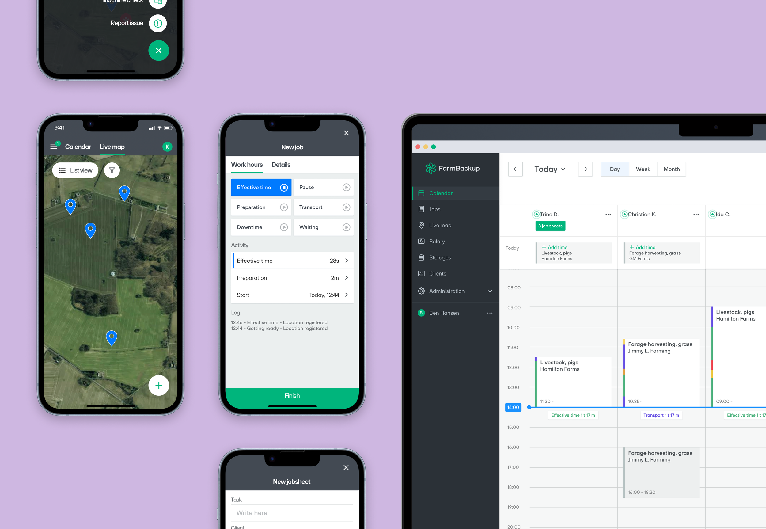
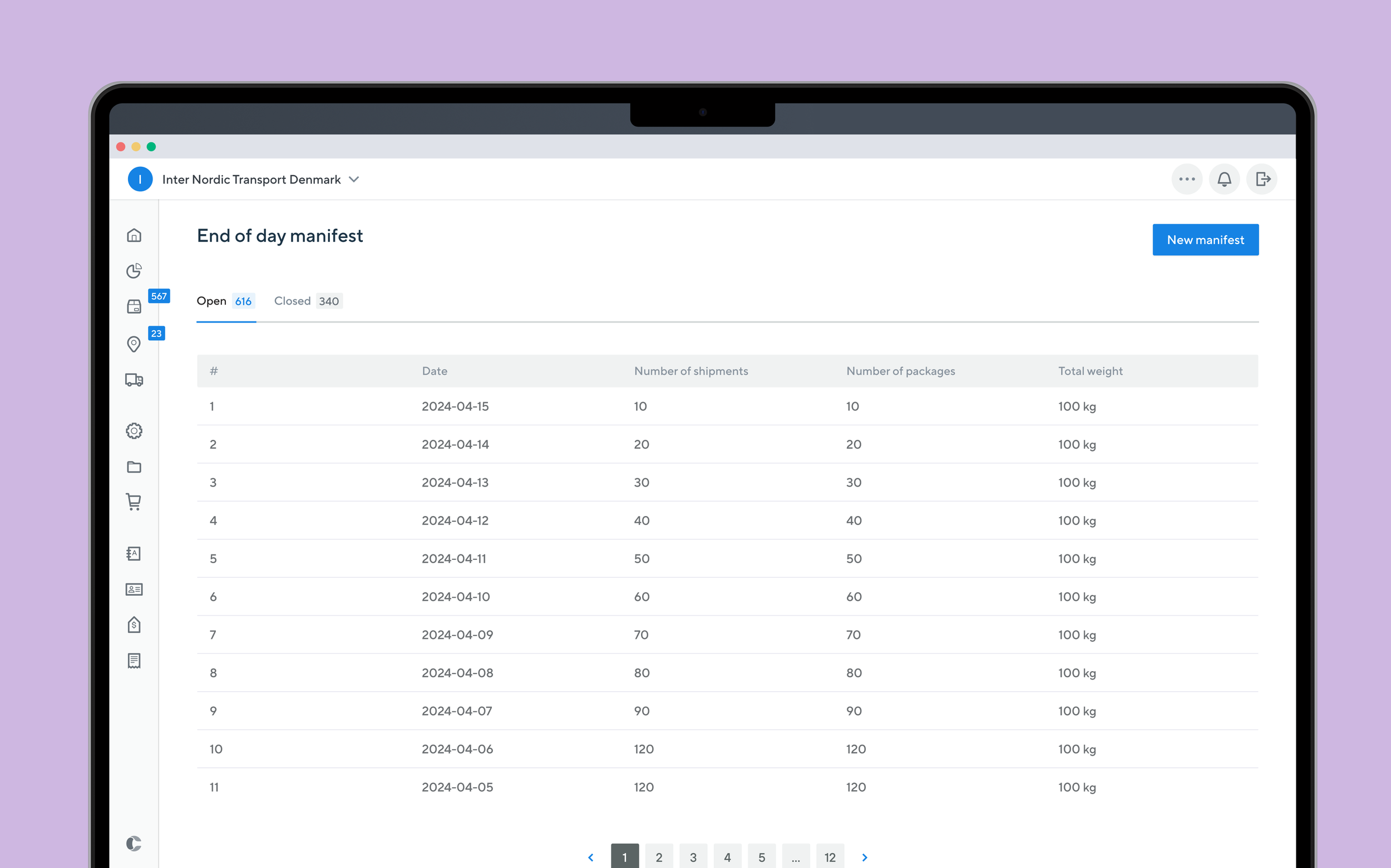
Users spend most of their workday inside the same data-heavy screens. The challenge was to make very long pages feel shorter, support fast repeated actions, and reduce cognitive load, without oversimplifying complex logistics workflows. At the same time, the product needed to support multiple brands through a flexible white-label setup.
The redesigned interface improved clarity, reduced visual noise, and supported faster task completion over time. Long workflows became easier to scan and navigate, while consistent patterns helped experienced users work more efficiently day after day.
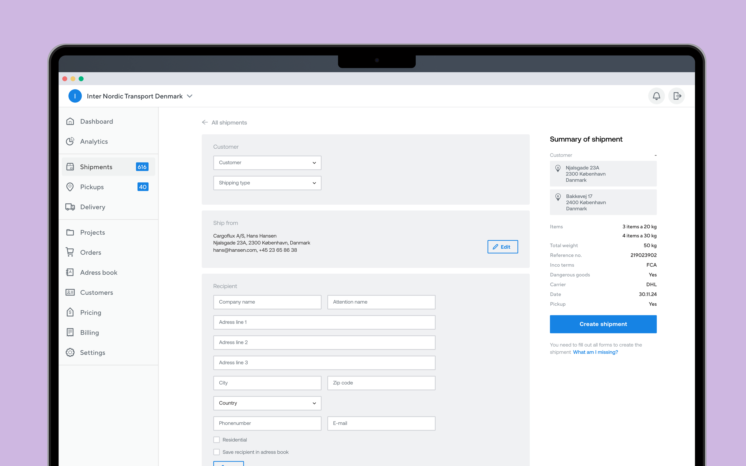
Much of the design focused on spatial efficiency, structuring labels, inputs, and supporting information to reduce perceived page length while preserving clarity and orientation across long workflows.
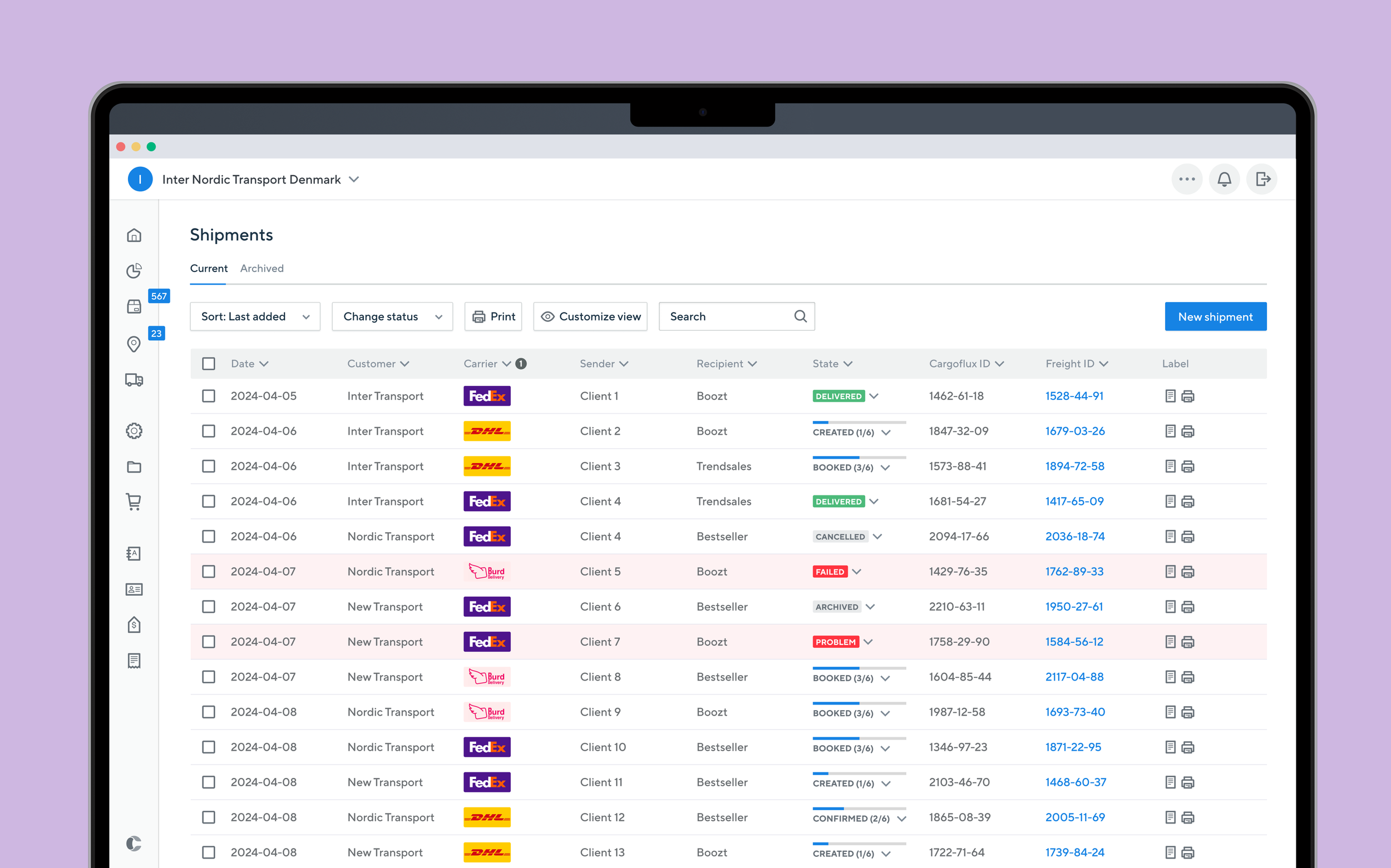
The interface was designed for repeated use. Core actions follow consistent patterns that become second nature over time, while secondary information can be progressively hidden as users gain familiarity.
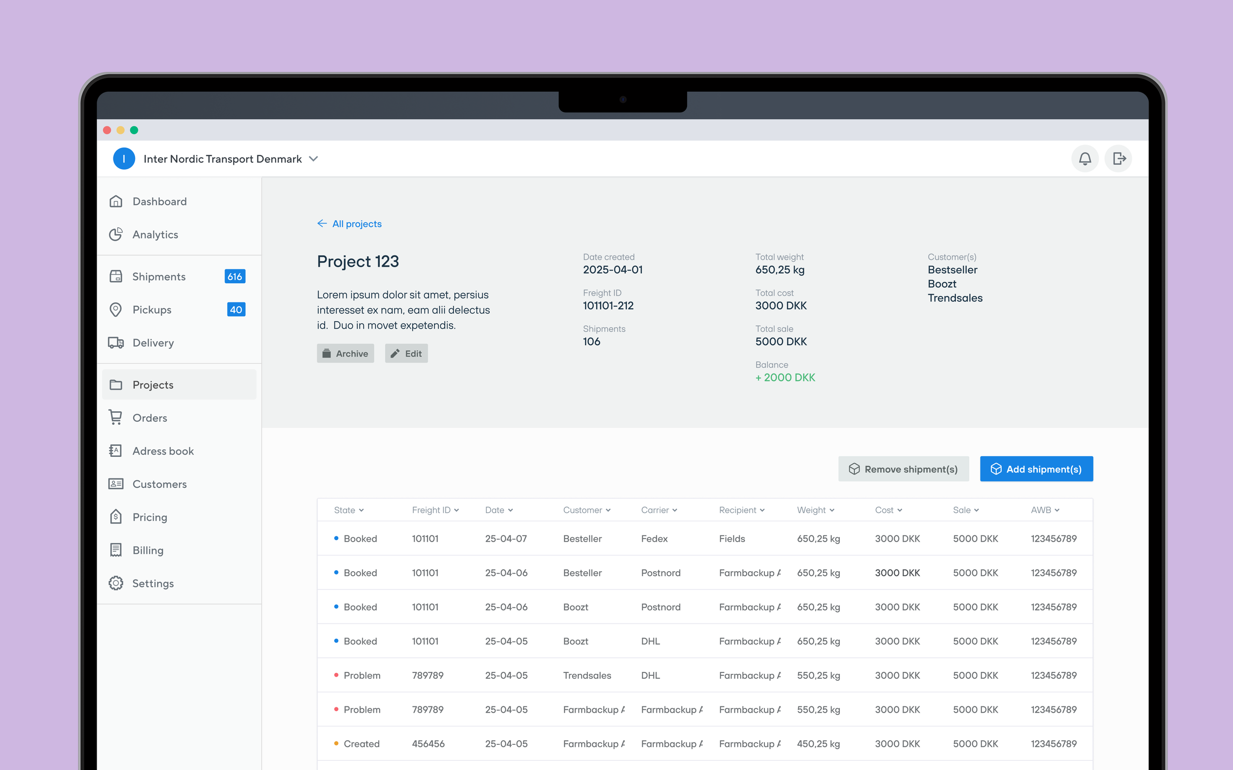
Consistent interaction models, shortcuts, and reusable components support power users working daily in the same views, while the underlying white-label design system enables scalability across multiple clients without compromising usability or coherence.
Next caseDesigning for Cargoflux highlighted the difference between first-time usability and long-term efficiency. The most impactful design decisions were those that reduced friction across repeated use, not those that added visual emphasis.