

Reimagining the way farmers manage their fields.
A UX/UI case built on data, empathy, and design systems.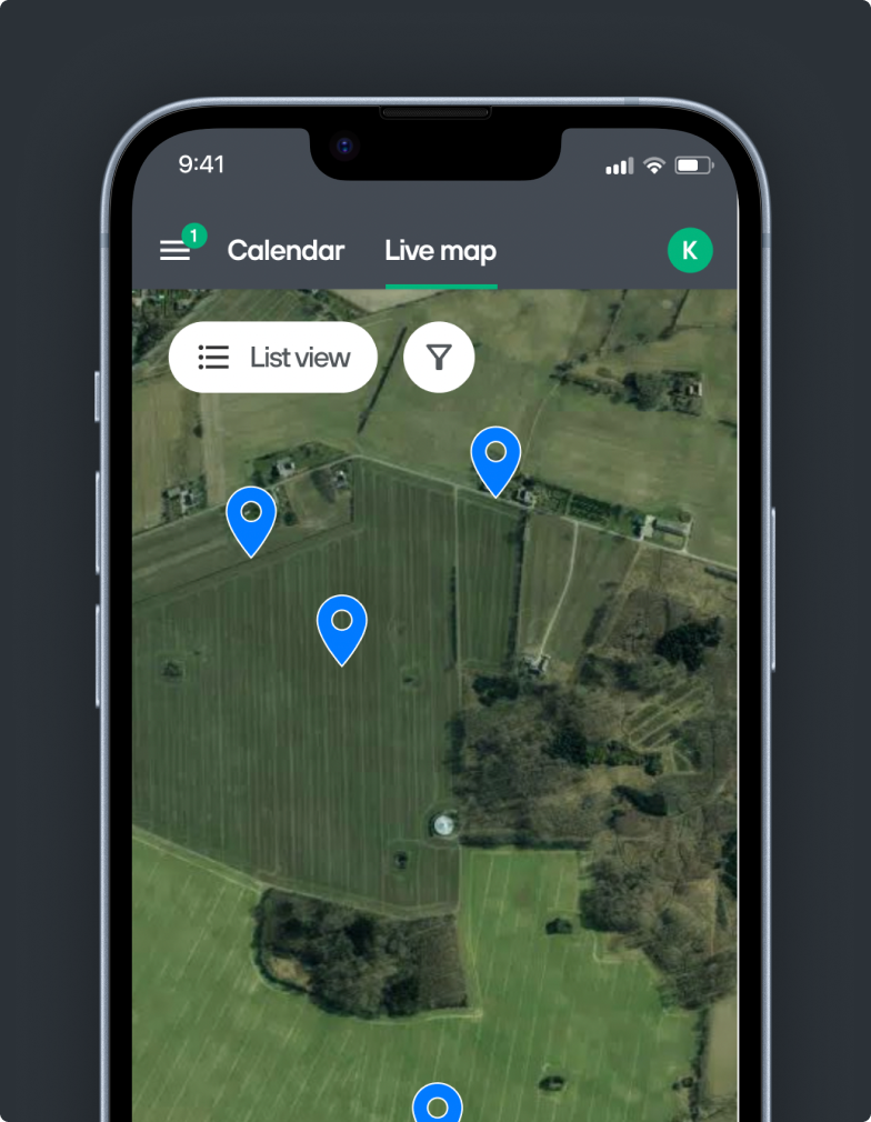
Company
Farmbackup A/S
Role
Lead UI/UX Designer
Timeline
Ongoing
Focus
Design System, UX flows, Product UI
Tools
Figma, AE, PS, Jira, Zeplin
Team
2 founders, 2 developers &
1 designer
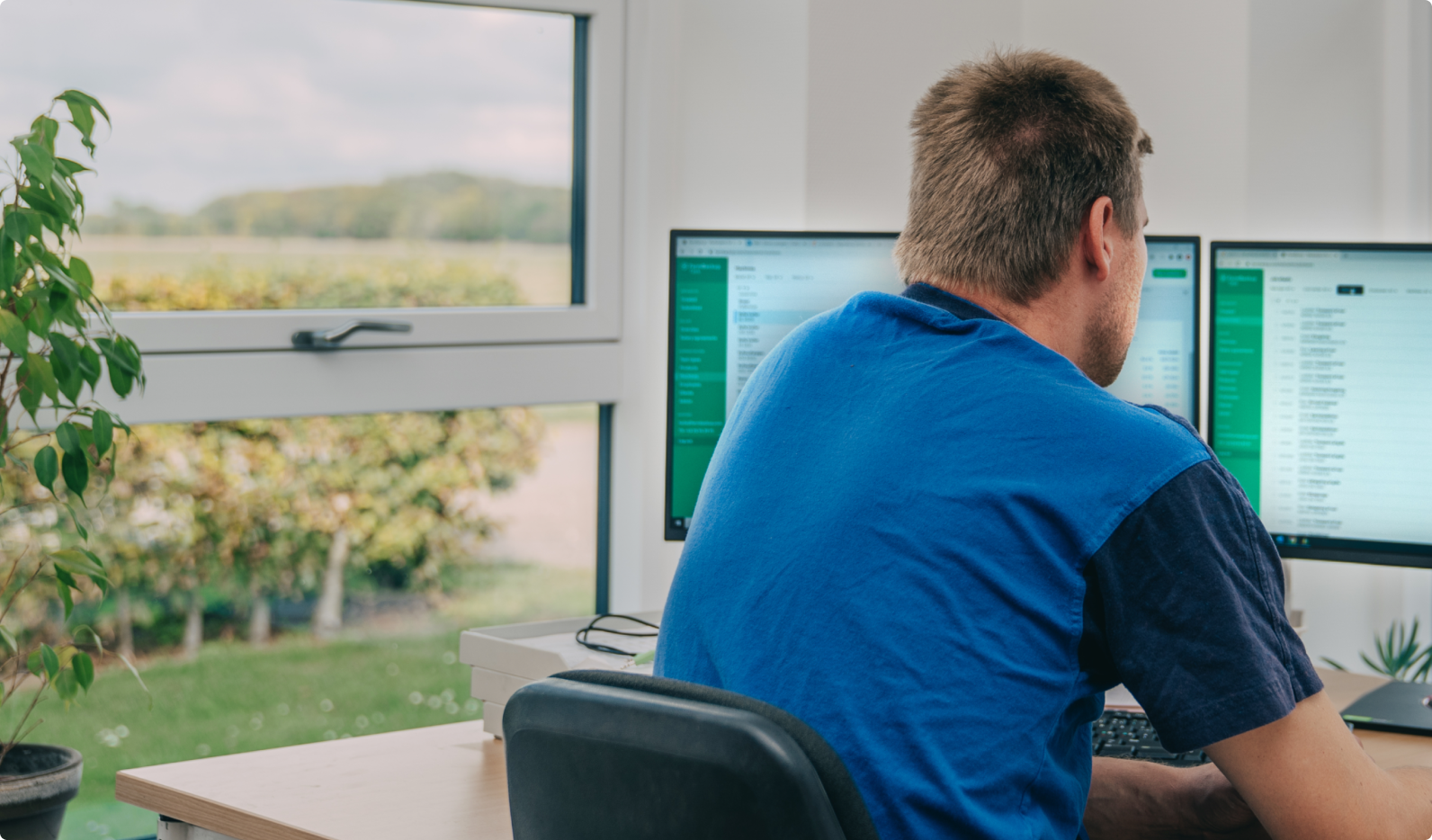
FarmBackup is a GPS and job tracking tool for farmers and contractors. It allows users to track machines in real time and manage key job details across the platform and app.
I worked closely with the founders and developers to design and build new features, while also leading a brand redesign and creating a new design system.
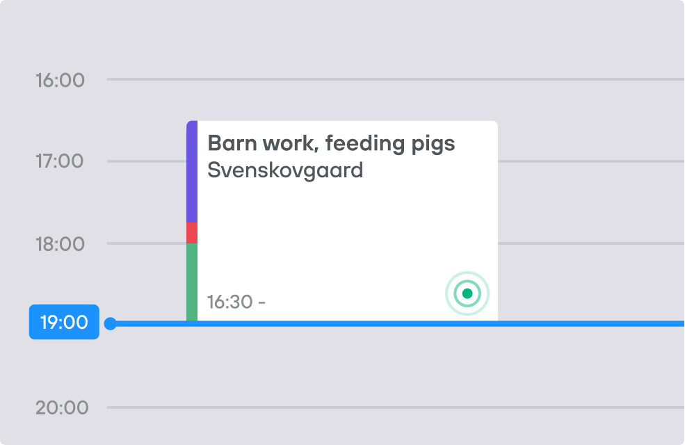
At the same time, I helped develop major features such as job planning with calendar views, storage management, safety checks, GPS tracking, and more.
We had a close relationship with users, which gave us fast, valuable feedback and strong momentum in our decision-making process.

Reimagining the way farmers manage their fields.
A UX/UI case built on data, empathy, and design systems.
Farmers needed an easier way to visualize and manage their fields across devices.
I worked on translating research insights into a product experience that felt intuitive and scalable.
Challenge
Inconsistent UI across modules
Establish scalable design system
Confusing workflows
DESIGN SYSTEM EVOLUTION
Role: Lead UX/UI Designer
Duration: 4 weeks
Team: 1 PM, 2 Developers
Tools: Figma, Maze, Notion
Goal
Simplify navigation & user flow
Visual identity drift
Unify look & feel
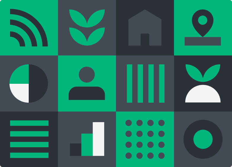
Billeder: komponentbibliotek, farver, typografi, spacing, UI-grids.
Tekst:
I introduced a structured design system focusing on hierarchy, accessibility and consistency.
Each module now follows shared patterns that balance flexibility and brand coherence.
💡 Du kan inkludere et før/efter af UI-elementer (ikke hele screens), så fokus er på beslutninger.
UX IMPROVEMENTS / FLOWS
Formål: Vis konkrete forbedringer — uden at fortælle en kronologisk historie.
Layout:
En sektion pr. initiativ. Fx:
“Simplifying the map overview”
Kort beskrivelse:
The original map was cluttered and hard to scan. I refined hierarchy and color usage to make spatial data easier to read.
Billeder: før/efter eller wireframe + UI.
“Designing for scalability”
Kort beskrivelse:
As new data layers were added, I designed flexible interaction patterns to maintain clarity.
💡 Du kan bruge 2–3 af disse “focus areas” som undersektioner.
Through iterative design and close collaboration with the product team, the platform now offers a more cohesive experience and stronger visual identity.
This ongoing process has reinforced my belief that sustainable design comes from clear systems, not static deliverables.
Next case